

Exploring Marble &
The Divine in Florence
Brochure Design
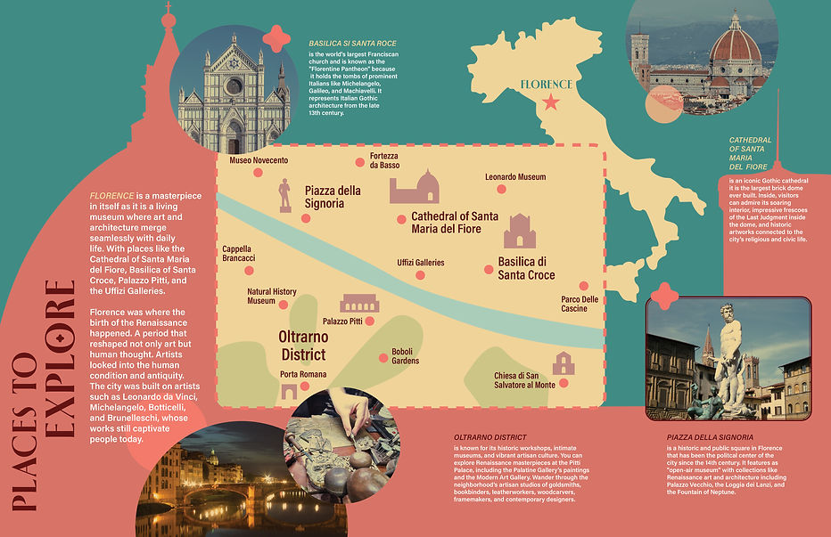
This brochure design is of the art and architecture of Florence, Italy that lists information of the places to go in a fun dynamic way. As well as, app development that connects with the brochure.


When coming up with the design concept, I recognized the famous "Dome" of Florence, Italy (Santa Maria del Fiore) would be a great structure surrounding the brochure layout. People can easily connect it to the location and the length of the church worked well for a trip-fold structure. I also decided to cut out part of the background of the Santa Maria del Fiore's image to allow the map from the inside to peak out giving a preview of what would be inside and makes it easier to turn the page for viewers.
Not only did I include different places to visit but wanted to highlight Michelangelo and his work that impacted Florence. The concept of the app would take on the structure of the brochure but would expand more on the information. For instance, include more places to go that pertains to art and architecture as well as highlighting other artists that impacted Florence.

#408580
#d97568
#efd399
For the color palette, I went with the green, orange, and yellow palette that is a sophisticated version of the Italian red and green colors. The fonts I used was Spalla for the headers and Acumin Variable Condensed for the paragraphs. I decided to include circles to connect to the structure of "the Dome" and a quatrefoil icon that connects to the shape used in Gothic churches.
