

Not For Sale
Poster Design
This poster design was based on the SDG Sustainable Development Goal: #5 Gender Equality. Specifically, Child Trafficking in San Diego, which has been a major issue.
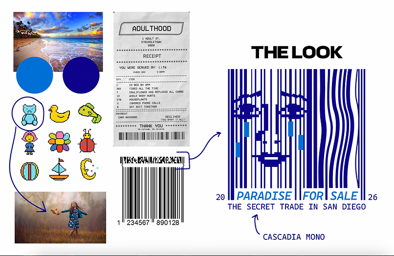

In order to appropriately translate this, I designed a barcode graphic to express the selling part of the business. The teddy bear represents children and innocence as it is a common toy that children own. The wavy part of the barcode represents waves to connect to the coastal location of San Diego.
For the color palette, I went with a light blue color #06acf0 to represent the coastal location of San Diego with beaches and water. The other color I went with is #803f99 purple to complement the blue color. The font I used is Cascadia Mono to connect to fonts on receipts.

